Tuesday, 7 December 2010

Deconstruction of Opening Scene (This is England)


This is England is an independent movie which falls under the drama genre. It was made in 2006 but set in 1986 which makes the filming really interesting. The most interesting part about the opening to this film is that it is all old footage from the 80s and none from the film. This gives an authentic feel to the film and gets the audience right into the time period.

 This is the first image of the sequence. It shows the house that comes up a lot in the film and is significant. This is showing the audience where the film will be set and making them familiar with the surroundings. The music playing is 80s which gets them into the mindset and also the way the colours are edited also seem very eightyish.

This image shows 'skinheads'. This is followed up in the film. It shows what sort of characters are in the film so the audience are comfortable when they do see these in the main part of the film. The opening sequence is basically about getting the audience relaxed in the time frame.


This is showing the nightlife in the 80s. It had a rock band showing as well as the people 'partying'. The audience now expect partying and rock from the film!


This image reflects the movie title. It is also in 'old' quality so it fits in with the time period. This reminds the audience of the title of the film and the time era, this continues throughout the whole sequence.

In this shot it shows somebody watching the football from a small TV screen and it looks like its from a shop. The shot is clearly from the 80s and shows the contrast between today's television and the old times. The writing is also consistent and the audience

Deconstruction of Opening Scene (Casino Royale)


Casino Royale is an action film from 2006. It was the first Bond film to not have an action filled opening scene, instead having credits. It starts with the song 'You Know My Name' by Chris Cornell. This is quite a 'busy' song. but is is also not what I would expect for a Bond film (but it works). The credits also have a lot of cartoon images with Bond (Daniel Craig) doing various things. This shows it is a lot more edited than other openings.

This is the first image that we see for the opening sequence. It shows Bond with a gun shooting to the screen and then blood covers the screen. This is automatically engaging the audience into the action and proving although there is a different style to the film, the amount of action will not change. The gunshot we hear at this point also shows that there will be a lot of action within the film.

This is the second image that we see, it shows Daniel Craig's (Bond) name in front of the symbols we associate and see on cards (clubs, spades, hearts, diamonds) this shows the theme of gambling and casino. This makes the audience know what is coming up and that it will stay true to the title as the theme has already came up in the opening sequence.

The third image in the sequence also has the writing for the credits on it. The font and style are consistent throughout the sequence. It also has an image of Bond brandishing a gun- this shows the action elements that are going to follow in the film. It has a lot of winding lines which could symbolise different paths that need to be followed.

This image actually shows some of the action that goes on in the Bond scene. It shows somebody coming at Bond with a knife and he disarms him takes the knife and the man falls and breaks into pieces. This puts focus on Bond and the things he does and will continue to do in the film.


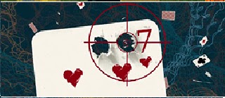
In this image it continuing the gambling theme with a playing card but it is also twisted as it shows a gun target and two gun shots in the card. This gives a clue about what will happen in the film. The action will focus around the gambling i.e. the casino.


This is the last image of the sequence. It has a futuristic feel to it and Bond is standing in the middle with the card symbols floating around him. The style and colours of the font have remained consistent as have the theme throughout the opening. I feel that this is what makes it so effective.

Tuesday, 30 November 2010

Deconstructing of opening scene (Se7en)


This is the opening of a thriller movie (Se7en), this film only shows the credits and a few clips. It uses a lot of close ups and music. This is one way to introduce thriller movies. The music is eery and quite upbeat, this is to set the mood for the whole film. It is quite a creepy song at the start (Nine Inch Nails- Closer) and this sets the mood for the rest of the film.

This is the first image we really see in the sequence. It shows the production of the film and a book. This shows some mystery into the film and we wonder is this book important? The writing is shaky and creepy, it flits along the page making the audience feel uneasy. This shows again later on which then magnifies its importance throughout the film.  


The second image in the sequence shows a pair of hands drawn on paper which adds to the mystery and they look pretty gruesome which adds to the thriller because we wonder; who do they belong to? It also shows the producers name. The writing is, again, shaky and adds to the creepiness along with the music. This puts the audience on edge.
This image is somebody scraping skin of of their fingers, this makes people wonder why he is doing it because it not an everyday thing to do and adds to the thrill of it. Also, they might think he is up to something which makes the audience curious as they wonder what kind of things you have to do that makes you scrape your skin off?


This is the next image we see. The film title is on this one, the font is (again) shaky and adds a feeling of unease to the film. It also shows another book being picked up which could lead the audiences mind to think that secrets are being kept and something is being plotted against somebody.


This image shows him writing something on the paper in, again, the same writing as before. The writing is quick and shaky and then it flashes to a close up on the paper. This again, makes the audience wonder what is going on.


This is once again the same font as it is consistent throughout the whole sequence. It shows a mans eyes getting scrapped out and then his whole head. This gives the movie a dangerous feel and we wonder who is this man, what has he done and what happened to him?

Again this has the writing. But it also has the mans hand again hes putting safety pins down on a piece of paper. This makes it evident that he is up to something and the audience would like to know what happens as it is mysterious.


This picture shows paper getting sewn up. This also adds mystery as there is obviously something to hide within the film. The audience wants to see this mystery unravel.


This is the last picture of the sequence. It looks like he is cutting out money which shows they are dealing with dodgy business and anything can happen... 

Tuesday, 23 November 2010

Week One

Groups
The first thing that we had to decide before starting on our main task was how many people were going to be in our group and who. There was a maximum limit of four people in each group and a minimum of one. In our group we decided to have four people, myself, Eloise Green, Amelia Hubbard and Katie Flatters. These are the same people that I worked with in my preliminary task and Eloise joined our group. We decided on this group as we thought we could work more effectively in a larger group and we could spread the work out evenly.


Here are the links to the other people in my group
Eloise Green
Amelia Hubbard
Katie Flatters


The Genre
The genre we have chosen to base our film on is 'Thriller'. We were stuck between choosing horror and thriller but we felt as horror was more gore it would be harder to produce an effective piece. Because we feel that this will be an interesting thing to work on and we will also enjoy doing it so the product can be to the best of our ability.